TYPOGRAPHY I
Neon Museum Book
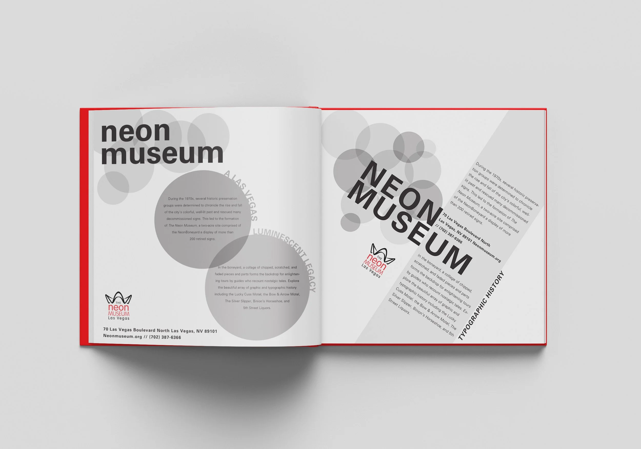
This project was based on the Neon Music which is known for there historic preservation comprised of Neon Boneyard in Las Vegas Nevada. The idea for this was to create multiple different pages using grid and typography principles like scale, axis, image and graphic elements. I also worked with collage and explored interesting compositions.
DESIGN PROCESS: I used collage with my typography and image which helped me create some of my end result pages in this project
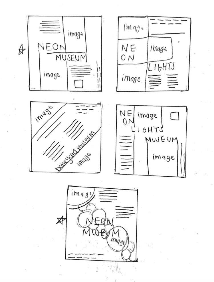
SKETCHES..
10pt Univers Light, Oblique + Bold Designs:
Scale Designs:
Axis Designs:
Graphic Elements Designs:
Image Designs:
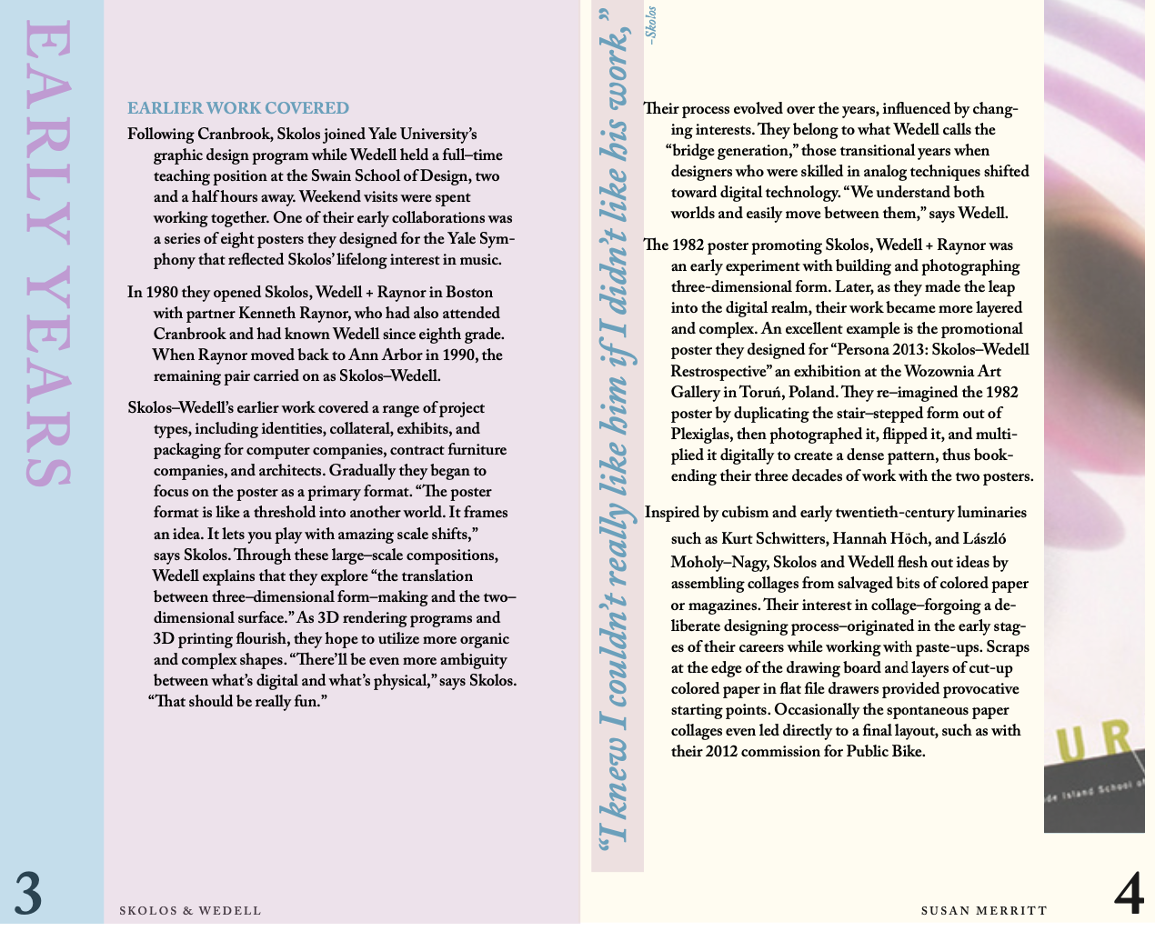
Scolos & Wedell Book
This book was designed for a couple who were AIGA 2017 Medalist. I had to use a biography created by Susan Merritt for the type and create a cohesive book design using these two resources. I mostly worked with image and graphic elements to pull this book together while having using a consistent color pallet.
SKETCHES:
Design Layout of Front Cover, Title Page, and Table of Contents
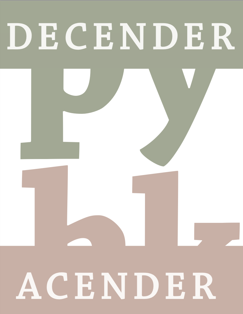
Carol Twombly Chaparral Poster Set:
This project was based on a type designer named Carol Twombly and her font called Chaparral. Chaparral was released in 1999 and it is known as a versatile hybrid slab serif typeface and is the opposite of geometric slab serif creations. Chaparral is known for its unique letter proportions that make it friendly and universal with all different types of weights ranging from light to bold. The Chaparral font family is also good for legibility in small text settings while still being readable in books and newsletters. It is mostly known as a highly functional design that is beautiful and a good choice when creating posters, books, and newsletters.
About Carol Twombly…
Carol Twombly developed the Chaparral font family by combining serif designs that were extremely popular in the 19th century and roman book lettering from the 16th century. Carol was born in 1959 and is currently sixty three years old. She attended Stanford University and Rhode Island School of Design and is an American designer that is extremely well known for her typeface fonts. Twombly originally focused on sculpture and followed her brother, who was an architect, to RISD which stands for Rhode Island School of Design. This is where she decided to go the Graphic Design route as her main study. Later on in life, she worked as a type designer for Adobe from 1988 to 1999. Along with creating this font she has also helped on creating other fonts like Trajan, Myriad, and Adobe Caslon. During many years with Adobe she has created so many popular well known fonts.


