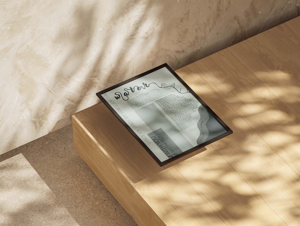
TYPOGRAPHY II
Music Logotype & Image Broadside
This project was focused on creating a logotype design based off of a favorite song and then digging deeper on a specific word using typography. I ended up with the word waterfall which came from the song "I'm With You" by Vance Joy. Once we chose the word, created a logo, and then implemented it into a poster we then created a sister poster that is cohesive with the first one but is still unique. This project mainly focused on using a Post Modern Grid system based off typography and image.
I'M WITH YOU VANCE JOY
I'M WITH YOU VANCE JOY
Design Process
After deciding on logotype, the next process was working with color and finding ways to incorporate shapes and grids
Color Swatches
Sister Poster Design ideas & Images
Sketches for Poster Two Using Image and Grid
Final Layout Ideas
FINAL POSTERS:
UI/UX App Creation
The purpose of this assignment was to become more familiar with the UI/UX process and create something of our own that we find interest in. The prompt was to make 8-10 layout pages in Illustrator and then use Figma to create an interactive project with clickable buttons. The app's purpose is mostly to be used as a map and guide to a specific genre in San Diego. I chose to do State Parks in San Diego. We then narrowed it down to 5-7 locations and went deeper into two or three spots. With this we had to create personas and make up people who find use in our app. I learned how to create a wireframe, make a working app, and design pages based on my theme. I fabricated an app using different layout techniques, color pallets, and images with type.
My Personas
Jack, Daisy, and Gwen were fake personas I created based off my app creation and made sure to dedicate this app to people with these similar interests with things like hiking, surfing, and overall just an out doors kind of person. I wanted to make sure I had enough information on my more in depth locations to ensure my audience was considered. I also made sure all my chosen locations were great places for someone who loves to exercise and get outside. After reading the personas this app is geared more towards a younger audience but can be used by anyone with a similar interest!
MAP LAYOUT
ICONS CREATED
DESIGNED PAGES
I wanted to create a cohesive design look with a similar style and color pallet throughout. Ended up making a landing page, map, tabs inside of the map, review page, weather page, and two locations that go more into depth!


